Digital Poster Design Trends to Watch in 2026
Shenzhen TopAdkiosk Display Technology Co., Ltd.
Add.: 2F, Bldg 10, Changfeng Industrial Park, Dongkeng, Fenghuang, Guangming, Shenzhen, China 518132
Mobile/WHATSAPP: 86-138 25769658
Email: marketing@topadkiosk.com topadkiosk@gmail.com
Skype: pghenry1
Wechat: adkioskhenry
English Web.: https://www.topkioskdisplay.com/
http://www.ad-kiosk.com/
https://www.toplcddisplay.com/
http://www.multitouchdigitalsignage.com/
https://www.youtube.com/channel/UCYVYNJHxLVEcQD8fuUxXNTA/videos?view_as=subscriber
https://www.facebook.com/TOPADKIOSKSHENZHEN/?ref=bookmarks
In 2026, you will notice that digital poster design trends change to showcase more energy and human connection. Designers are experimenting with styles like Modern Art Nouveau Revival, bright color palettes, flexible layouts, and hand-drawn looks. These digital poster examples are important because they help you connect with people and strengthen your brand. More individuals are seeking digital designs that feel authentic and unique. By incorporating new digital poster ideas, you stay ahead of the curve and enhance the creativity of your work.
Key Takeaways
Keep up with graphic design trends. This helps your posters stand out. It also helps you connect with people.
Use bright colors in your designs. Try playful layouts too. These choices make your posters feel lively and fun.
Add realistic textures to your posters. Use surreal elements as well. This gives your designs more depth and creativity.
Try using mixed media in your posters. Add 3D elements to them. This makes your visuals unique and interesting.
Think about sustainability in your designs. Make your posters accessible to everyone. This helps you reach more people and shows you care about important values.
Why Graphic Design Trends Matter
Staying Ahead in the Future
It is important to follow graphic design trends 2026. This helps you stay ahead. Designers who learn new trends can make posters that stand out. Using the latest technology and ai innovation makes your posters look cool and new. You can get more people to notice your designs. Your posters will stay important and up-to-date.
Here are some reasons why graphic design trends matter:
Visual engagement and attraction help you get attention fast.
Branding and identity make your posters easy to remember.
Information delivery lets you share messages quickly.
Enhancing user experience makes people visit your site more.
Flexibility and adaptability let you use posters in many places.
Graphic design trends 2026 change how people see art. If you want to inspire others, try new styles and tools. Technology helps you make posters that fit current trends. When you keep learning, you become a leader in poster design.
Tip: Mix bright colors and realistic textures in your posters. This will help your designs look modern and full of energy.
Impact on Engagement
You can get more people interested by using graphic design trends 2026. Following new trends helps your posters connect with others and get noticed.
The table below shows how staying updated keeps you competitive and important:
Evidence | Explanation |
|---|---|
Staying updated with design trends lets designers use styles people like now. | This helps make designs that look good and grab attention. |
Companies must be quick and talk to design experts to see which trends last. | This makes sure designers know what is popular and what will stay important. |
Talking to your audience often helps you learn what they want. | This lets designers make work that is trendy and matches what people like. |
Graphic design trends 2026 help you make posters people want to share. When you know what is coming, you make posters that teach and excite. You can use technology and ai innovation to try new effects. If you keep learning, you will always find new ways to connect with your audience.
Immersive & High-Energy Styles
Bright, Saturated Colors
In 2026, digital posters use lots of energy. Designers pick bright, saturated colors to get your attention fast. Neon colors and strong contrasts make posters stand out. Playful layouts and fun fonts bring happiness to each design. Brands use bold colors to connect with people and be noticed.
Bright colors and fun fonts make posters joyful.
Surprising layouts feel lively and full of action.
Mixed patterns and different fonts make things look wild but planned.
Strong colors make people feel emotions.
Exciting layouts grab your eyes right away.
Moving shapes and bright colors make posters look alive.
Fun details add jokes and surprises.
Designers use strong color mixes and two-tone looks for energy. Companies use high-contrast colors to help their brand. You can try new color mixes to make your poster special. Use neon colors or mix bold colors with fun fonts. This helps your poster get noticed in busy places.
Tip: Use bright colors and fun layouts to make posters look new. Mix strong colors with bold fonts for a big effect.
Realistic Textures with Surreal Elements
You can make your digital posters deeper by mixing real textures with surreal parts. This style helps you be creative and try new ideas. Surrealism lets you show feelings and thoughts that are not normal. Digital tools help you make amazing art that people want to see.
Characteristic/Impact | Description |
|---|---|
Encouraging Creativity | Surrealism lets you try new things and think in new ways. |
Expressing the Unconscious | You can show feelings and ideas that are not always logical. |
Visual Impact and Engagement | This style makes art that looks great and makes people feel things. |
Pushing Artistic Boundaries | You try new ways to show your ideas. |
Reflecting the Complexity of Human Experience | Surrealism shows dreams and strange things that many people like. |
Adaptability in the Digital Realm | You use digital tools to make cool art more easily. |
You can put real textures with dreamlike shapes or strange images. This mix makes posters feel both normal and mysterious. Try using photo textures with weird shapes or odd colors. You make people think and want to learn more. This trend helps you make posters that make people curious and interested.
Nostalgic vs. Futuristic Aesthetics
Retro-Futurism in Posters
Retro-futurism mixes old and new styles together. You can use ideas from the past to make posters look cool. This style uses neon colors and warm vintage tones. These colors remind people of old pictures and ads. You can choose display fonts that look like they are from a certain time. This makes your poster feel both old and new.
Textures and grains make posters look aged. You might add film grain or scratches for an old look. Vintage drawings and graphics from retro ads add fun to your design. Some designers use tech elements that look like old computers. This makes your poster feel like it is from another time.
Neon and vintage colors give posters energy.
Display fonts from the past look interesting.
Film grain or scratches add texture.
Retro graphics or tech parts make posters stand out.
Retro-futurism helps you make posters that feel old and new at the same time.
Heritage-Inspired Warmth
Heritage-inspired warmth makes posters feel cozy and timeless. You can use simple layouts to show what matters most. Asymmetry puts things off-center and makes designs unique.
The table below shows important elements you can use:
Element | Description |
|---|---|
Simplicity | Show only the most important parts and keep it clean. |
Asymmetry | Put things off to one side to make posters more fun. |
Wabi-sabi | Use rough textures and small flaws to make designs feel real. |
Negative Space | Leave empty spots so your main message stands out. |
Harmonious Colors | Use soft, natural colors that feel calm and balanced. |
You can mix rough textures with soft colors for comfort. Try using empty space to help your design breathe. When you use these ideas, your posters will feel warm and friendly. This style helps you connect with people who like honest and human designs.
Multi-Purpose Vector Art
Beyond Traditional Framing
You do not have to use old poster layouts. Vector art lets you make shapes and lines that always look sharp. Your images will not get blurry when you make them bigger or smaller. This keeps your posters clear on screens, prints, or billboards.
Vector art lets you try new things. You can move shapes outside the normal borders. Try putting shapes on top of each other or at odd angles. This makes your posters look different and modern.
Here are some good things about using vector art in new ways:
Vector graphics always look sharp, no matter the size.
You get good images with small file sizes, so they load fast.
You can change colors quickly with HEX codes, HSB sliders, or a color picker.
Tip: Use vector shapes to make fun layouts. Put things outside the frame to get people’s attention.
Versatility in Digital Poster Examples
Vector art works for many poster styles. You can use it for bold graphics, fun drawings, or simple icons. This helps you make posters for different people and uses.
See how you can use vector art in digital posters:
Poster Type | How Vector Art Helps |
|---|---|
Event Posters | Make cool icons and logos |
Brand Promotions | Change colors to fit your brand |
Educational Posters | Make clear charts and infographics |
Social Media Ads | Resize graphics for each platform |
You can update your poster by changing colors or size. Vector art lets you try new ideas without starting over. This saves time and keeps your posters looking new.
Note: Vector art gives you lots of choices. Try new shapes, colors, and layouts to make your next poster great.
Grainy Blur & Mood Effects
Evoking Emotion in Posters
You can use grainy blur and mood effects to make posters feel warm and real. Designers in 2026 add grain, noise, and texture to move away from perfect computer graphics. These effects help posters look more human and less cold. When you add grainy blur, you create a dreamy and old-fashioned feeling. This style is different from sharp designs used before. It helps you tell stories and set the mood for your poster.
Grainy blur backgrounds work like lights in photos. They help set the feeling for your design. You can use this style for music posters, magazine graphics, or any poster where feelings matter more than clear details. Soft gradients and see-through layers add depth and movement. You make your poster look rich but still simple and modern. Painterly gradients mix simple and expressive styles, so your poster feels both plain and full of emotion.
Tip: Use grainy blur to make your poster feel like you are inside it. This effect helps people feel close to your design.
Techniques for Grainy Blur
You can try many ways to make grainy blur effects in your digital posters. Start by using the CSS isolation property. This makes a new layer for blending effects. Play with SVG settings to change the noise and texture. Try different kinds of gradients, not just straight ones, to make the grainy look better.
Stack many layers with CSS blending to add depth.
Use SVG filters like Gaussian blur for different looks.
Change how rough the noise is to fit your mood.
Use painterly gradients to copy light and texture.
These ways help you make posters that feel deep and full of atmosphere. You can mix soft changes and see-through layers to show movement. Grainy blur effects let you show feelings and mood in your design. Try these ideas to make your next poster special and easy to remember.
Note: Grainy blur and mood effects give your posters a special style. Try these tools to get creative and connect with people.
Imperfect by Design
Playful Grids & Typography
You can help your posters stand out with playful grids and typography. This trend lets you move away from perfect lines and neat layouts. You add personality by using uneven lines, funny characters, and big shapes. Kid Core design uses these things to make posters feel fun and full of life. You do not have to follow strict rules. You can let your creativity guide you.
Use uneven lines to make your poster lively.
Add quirky characters for extra charm.
Try big shapes to get people’s attention.
Playful grids make your poster feel more human. People like designs that look like a person made them. You can mix fonts, change sizes, and move words around. This way, you connect with people who want something real and special. Your design will have personality and stand out from simple, plain styles.
Tip: Mix different fonts and shapes. Let your poster tell its own story.
Experimental Layouts
You can try many experimental layouts to make your digital posters new and bold. Imperfect by design means you show real feelings and human mistakes. You can use naive design with childlike pictures, uneven colors, and scratchy lines. Punk grunge design adds roughness and surprise, going against clean looks. Grainy blur design uses soft effects for old memories and feelings.
Here are some layout ideas you can try:
Imperfect by design for real expression
Naive design with childlike, imperfect art
Punk grunge design for wild energy
Grainy blur design for strong feelings
Motion graphics to tell stories
Type collage design with many fonts and styles
Blueprint design with drawing parts
Trinket design using everyday things
Surveillance design with modern UI parts
You can use AI tools to help make these layouts, but keep your own style. Motion graphics and cool typography help you tell exciting stories. You make a design with personality that fits your brand and connects with people. Good looks and usefulness work together, so your poster is nice and works well.
Note: Imperfect by design trends let you try new things and show your creative side. Try new layouts and styles to help you make your next poster.
3D & Mixed Media Trends
Depth with 3D Elements
You can make your digital posters stand out by adding 3D elements. In 2026, designers use 3D not just for show but to create real depth and space. This makes your posters look more interesting and helps people focus on what matters. You can use several techniques to add depth:
Overlap shapes and images to show which parts are in front.
Add shadows and highlights to make objects look real.
Change the size and place of objects. Bigger things look closer, smaller things look farther away.
Use warm colors for objects you want to bring forward. Cool colors help things fade into the background.
Blur some parts and keep others sharp. This trick makes your poster look like a photo with focus.
Draw lines or use fading colors to show distance.
You can also use new printing technology to layer images. Some designers use lenticular printing, which makes posters look like they move when you change your view. These tricks help you create posters that feel alive and full of energy.
Tip: Try combining different 3D effects. You can make your poster look deep and exciting.
Mixed Media Collages
You can use a mixed-media approach to make your posters unique. In 2026, designers mix photos, drawings, words, and 3D shapes in one poster. This style gives your work many layers and makes it feel rich. You move away from flat designs and show more personality.
Many designers use AI tools to blend digital and hand-made art. You can mix a photo with a drawing or add 3D shapes to a simple background. This way, your poster tells a story and feels real. People like posters that show real life and personal ideas.
A mixed media collage lets you:
Combine photos, illustrations, and text for a bold look.
Add 3D shapes for extra depth.
Use AI to create new blends of art styles.
Show your own style and ideas.
This trend helps you make posters that stand out. You can inspire others by showing your creative side and using new tools.
Note: Try mixing different art styles in your next poster. You will find new ways to express your ideas and connect with your audience.
Dynamic Collages & Fragmented Glass
Creating Visual Impact
You can help your posters get noticed with dynamic collages and fragmented glass effects. These styles make your designs look full of energy and movement. Dynamic collages show how fast and busy digital life is today. Your pictures look like they are always changing. Fragmented glass effects give your posters a sharp and movie-like style. You can make your designs look deep and a little tense.
Dynamic collages show how fast digital life moves.
Fragmented glass effects add drama and excitement.
Layering broken glass textures and light refractions looks futuristic.
These styles show both weakness and strength.
You make your posters feel surprising and new.
These effects help you catch people’s eyes. People like posters that look bold and different. You make viewers want to look closer and think about what your poster means.
Future-Ready Poster Effects
You can use easy tips to add these trends to your posters. Designers mix pictures that do not match. You can put together drawings and photos. You leave sharp edges and white lines from cutting and pasting quickly.
Designers are putting together pictures that do not belong together, like drawings and photos. They do not try to hide the rough edges or white lines from cutting and pasting. This makes the poster look both different and interesting, mixing things that do not usually go together.
You can follow these steps:
Cut and paste pictures with rough edges.
Put broken glass textures on top of your main images.
Use light refractions to make your poster shine and look deep.
Mix bright colors with sharp shapes.
Combine different art styles to make your poster stand out.
You make posters that look new and ready for the future. These effects help you show your creativity and new ideas. You can inspire others to try new things and make cool digital posters.
Sustainable & Inclusive Design
Eco-Inspired Aesthetics
You can help the Earth by picking eco-inspired looks for your digital posters. Many brands want to show they care about nature. You can use colors and textures that remind people of the outdoors. Try using green, brown, and blue shades. These colors make your poster feel calm and fresh. You can add leaf shapes, recycled paper looks, or water ripple effects. These small choices show your audience you care about sustainability.
Designers also think about how their art affects the world. You can use simple graphics and fewer effects to save energy when people see your posters online. This trend is growing because companies want to help the planet. The table below shows how sustainability and inclusivity change poster design in 2026:
Trend | Description |
|---|---|
Eco-friendly designs are becoming a priority as more companies seek to reduce their environmental impact. This trend is influencing everything from the materials used in physical products to the sustainability of digital operations. | |
Inclusivity and Accessibility | There is a growing emphasis on creating designs that are inclusive and accessible to all. This includes considering color blindness and dyslexia in visual and textual content, ensuring that everyone can enjoy and benefit from the design. |
Tip: Try using natural textures and earthy colors in your next poster. You can inspire others to care for the planet with your design choices.
Accessibility in Graphic Trends
You can make your posters better for everyone by thinking about accessibility. Some people see colors in a different way or have trouble reading some fonts. You can use high-contrast color mixes to help people with color blindness. Pick fonts that are easy to read for people with dyslexia. Simple layouts and clear words help everyone understand your message.
Designers now pay more attention to these needs. You can check your poster with online tools to see if it is easy to read. The table below shows why inclusivity and accessibility are important in design:
Aspect | Description |
|---|---|
Inclusivity and Accessibility | Emphasis on creating designs that are inclusive and accessible to all, considering color blindness and dyslexia. |
Use big, bold text for important information.
Do not use only color to show meaning.
Test your poster with different people to get feedback.
Note: When you make your posters accessible, you reach more people and show that you care about everyone’s experience.
Applying Graphic Design Trends 2026
Experimentation & Adaptability
You can be a leader in digital poster design by trying new things and changing with the times in 2026. Designers use brave ideas to make posters look fresh and different. You can test out new layouts, colors, and textures to help your posters stand out. AI tools let you work faster and add special touches to your art. You stay ahead by learning about graphic design trends 2026 and using them in your projects.
“AI makes design quicker and easier, so many artists are choosing styles that look raw, full of feeling, and not perfect. Think about wabi-sabi, hand-drawn textures, and art that shows real feelings. This trend shows that mistakes can be beautiful and that being open is a good thing.”
You can use stitched borders or letters that look like a collage to make your posters feel more personal. Designers like to use the Distorted Cut trend to make posters that grab attention. The Candid Camera Roll trend gives you real and low-cost pictures that help people remember your brand.
Trying new things helps you make new branding ideas.
AI helps you make cool and interesting art fast.
Changing with graphic design trends 2026 keeps you ahead of others.
You get better as a designer when you try new things and learn from each project. You make your posters easy to remember by mixing different styles and tricks.
Showcasing Digital Poster Examples
You can get ideas by looking at digital poster examples that use graphic design trends 2026. These examples show how each trend works for different brands and people. You see how designers use not-perfect art, big letters, and fun layouts to connect with others.
Trend Name | Description | Best For |
|---|---|---|
Childlike, imperfect visuals that feel human and approachable. | Children’s products, food & beverage, fashion, creative agencies, arts & festivals, health & wellness | |
Type Collage | Bold typography that creates visual energy and captures attention. | Brands wanting to stand out in a crowded digital space |
Blueprint Design | Detailed, technical visuals that playfully over-explain. | Brands appealing to design-savvy consumers and youth culture |
Trinket Design | Everyday objects arranged to tell a story and reflect identity. | Lifestyle, fashion, and wellness brands |
Punk Grunge Design | A rebellious style that injects soul into design. | Brands looking for a gritty, authentic aesthetic |
Grainy Blur Design | Soft-focus effects that evoke mood and emotion. | Creators aiming for warmth and authenticity in visuals |
Signal Graphics | Energetic visuals inspired by '90s nostalgia. | Brands wanting to capture a vibrant, cartoonish aesthetic |
You can use these digital poster examples to help you think of new ideas. Try mixing naive design with type collage for a fun look. Use blueprint design to explain things in a cool way. Trinket design lets you tell stories with everyday items. Punk grunge design makes your posters bold and real. Grainy blur design adds feeling and warmth. Signal graphics give your posters energy and remind people of the '90s.
Tip: Check out digital poster examples from many different businesses. You can find new ways to use graphic design trends 2026 and make your posters special.
You can stay ahead by embracing new graphic design trends for 2026. Try different styles and techniques to spark your creativity. Keep learning and adapt your workflow to include fresh ideas. Look at digital poster examples for inspiration. Use what you learn to make posters that connect with people and stand out.
Tip: Experiment with one new trend each month. You will grow as a designer and keep your work exciting.
Digital Poster Design Inspiration and Ideas
The core of digital poster design is to capture attention and convey a message within seconds. Unlike traditional print posters, digital posters have unique weapons: motion, sound, and interactivity. Below is a systematic source of inspiration covering form and content, designed to break through creative blocks.
🎯 1. Industry‑Specific Practical Ideas
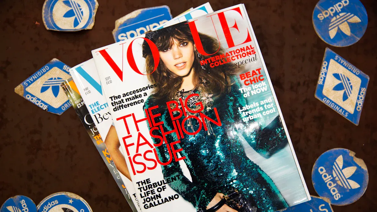
🛍️ Retail & Fashion
Dynamic product close‑up – Let a product rotate slowly on a black background with flowing highlights to create a premium feel. Pair with large sans‑serif pricing and selling points. Works well for jewellery, watches, consumer electronics.
Model “breaking the frame” – With a static background, let the model’s foot, hand, or prop extend beyond the border – creating a 3D illusion that catches the eye.
Comparison animation – Split the screen into two halves: “before” in dull greys, “after” in vivid bright colours, with a smooth stretch animation to demonstrate effect. Great for skincare, cleaning products.
Countdown + limited‑time offer – Prominent countdown numbers (“Only 2 days left”) with product imagery, and a flashing “Buy now” or QR code.
🍔 Food & Beverage
Tempting cooking process – Slow‑motion video of cheese pulling, sauce dripping, steam rising – sensory stimulation far beyond static images. Ideal for burgers, pizza, desserts.
Ingredients “flying in” to form the dish – Elements fly in from all sides and assemble into the finished product, then display the price. Perfect for salads, juice bars.
Menu item highlight with pulsing glow – Use a halo or rainbow ring to highlight special or high‑margin dishes, and rotate short customer reviews.
Daypart adaptation – Automatically change background colour and recommended content based on time of day (breakfast, lunch, afternoon tea) – intelligent touch.
🏥 Healthcare & Services
Gentle icons with subtle animation – Icons for appointments, wayfinding, hand washing float softly against a calming green or blue background – reducing anxiety.
Doctor profile rotation – Photo, name, speciality, consultation hours – switch every 5 seconds to avoid information overload.
Health tip step counters – Use a Gantt‑style or circular progress bar to show steps for “proper handwashing”, with short text.
🎬 Events & Promotions
Layered motion for key visuals – Animate title, background, and decorative elements separately, moving in at different speeds and ways (e.g., title fade‑in, background slow zoom) to add depth.
Speaker/artist spotlight – Avatars slide in from the left, stay for 2 seconds, then slide out – next one replaces. Include a catchphrase or quote bubble.
Animated route guidance – Use bouncing dots or extending dashed lines to show event location or station – far better than static maps.
🛠️ 2. Visual Design Techniques
High‑contrast backgrounds – Use gradients or dynamic geometric patterns (triangle waves, dot diffusion) instead of solid colours to give the image a sense of breath.
Kinetic typography – Main titles can use heavier weights with character‑by‑character fade‑in or stretch effects; subtitles framed with thin line boxes.
Light “sweep” effects on text – Use light sweeps or neon glow on text edges – especially effective for night‑time venues.
High‑res image with semi‑transparent overlay – Keep the background image clear while adding a semi‑dark overlay on text areas to ensure readability.
Rhythm control – Avoid animating all elements at once. Use “keyframe thinking”: background first, then main visual, then text – each step 0.5–1 second apart.
🔧 3. Efficient Production Tools
Tool | Type | Features | Best For |
|---|---|---|---|
Canva | Online (with motion) | Massive templates, simple animations, video export – free tier sufficient | Non‑designers, quick production |
Adobe Express | Online | Animated stickers, auto‑captions, subtle motion effects | Social media style needs |
Rocketium | Online (digital signage focused) | Batch generate different sizes/versions, template library | Multi‑location requirements |
After Effects | Professional software | Full‑service motion design – any effect imaginable | Professional teams or outsourced |
Pika | AI motion tool | Upload static image, generate motion (smoke, water, fire) in one click | Quickly animate existing posters |
Jitter | Lightweight online | Minimalist motion templates, UI/text focused | Tech/ minimalist style |
📐 4. Technical Specifications & Optimisation
Resolution – Match the target display (e.g., 1920×1080 landscape or 1080×1920 portrait). Avoid using too low resolution, which causes blurriness.
File format – MP4 (H.264) offers best compatibility and manageable file size. GIF works for very short loops but has low colour depth and large size.
Loop duration – Keep each piece 15–30 seconds, as longer loops may lose viewer interest. Rotate 3–5 different pieces.
Motion speed – Allow key information (prices, discounts) to stay on screen for at least 3 seconds so viewers have time to read.
Brand consistency – Keep your brand logo and standard colours fixed in a corner of the main visual – they should not change as content rotates.
I hope these ideas and techniques help you create impressive digital posters. If you need more specific ideas for a particular industry or product, feel free to ask – I can provide more tailored inspiration.
FAQ
What is the best way to start designing a digital poster?
You should begin by choosing a clear message. Pick a trend that matches your goal. Sketch your layout on paper or use a digital tool. Try different colors and fonts. Test your design with friends for feedback.
How can I make my poster stand out in 2026?
Use bold colors, playful layouts, or mixed media. Try adding 3D elements or grainy blur effects. Mix old and new styles. You can experiment with imperfect designs. Always look for ways to show your unique style.
Which tools help with digital poster design?
You can use tools like Adobe Illustrator, Canva, or Figma. AI-powered apps help you try new effects quickly. Many tools offer templates and vector art. Choose one that fits your skill level and project needs.
How do I make my poster more accessible?
Pick high-contrast colors and easy-to-read fonts. Avoid using only color to show meaning. Test your poster with accessibility checkers. Ask others for feedback. This helps everyone enjoy your design.
Can I mix more than one trend in a single poster?
Yes! Mixing trends often leads to creative results. You can blend retro-futurism with grainy blur or add 3D shapes to a playful grid. Try different combinations to see what works best for your message.
See Also
Exploring Emerging Digital Signage Trends For 2026
Latest Innovations In Digital Signage Technology For 2026
Popular Digital Signage Solutions Gaining Attention In 2026
Seven Key Trends In Digital Signage Technology For 2026
Leading In-Store Digital Signage Innovations Transforming Retail 2026