How to design a creative high quality Wall Mounted Touch information Kiosk
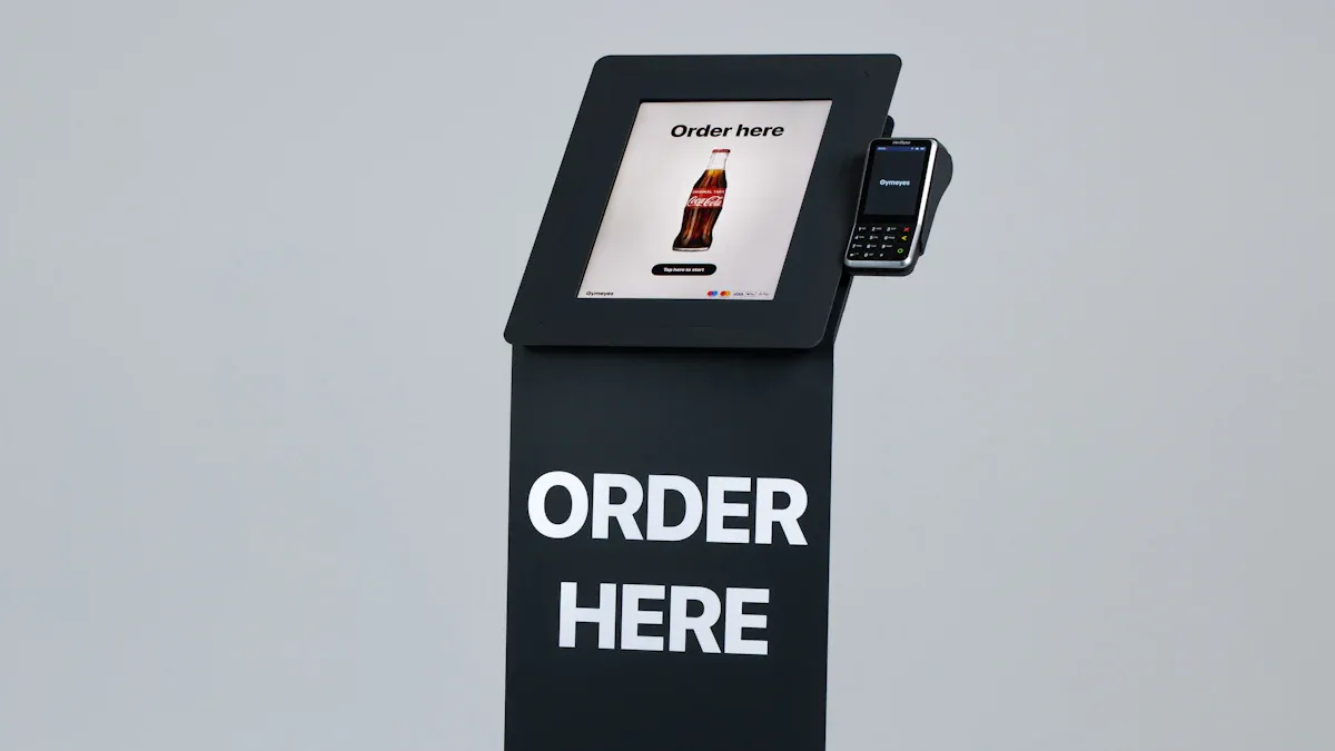
You can create a high quality Wall Mounted Touch information Kiosk by considering what users desire and how they interact with technology. By incorporating clear pictures, engaging animations, and multimedia, you can enhance user engagement significantly. Research indicates that utilizing the right images can boost views by 94%. The compact size and straightforward setup of wall-mounted kiosks contribute to their popularity in various public and business environments.
Key Insights | Description |
|---|---|
Compact Design | Facilitates usage in numerous locations |
Ease of Installation | Increases appeal in public and business settings |
To achieve the best results, focus on using robust hardware and a simple, enjoyable interface while learning how to design a creative high quality Wall Mounted information Kiosk.
Key Takeaways
Find out who will use your kiosk. This helps you make content and features that fit their needs. - Pick tough materials like commercial-grade steel and shatterproof glass. These make the kiosk last longer. - Make the interface simple. Use big buttons and easy navigation so people can use it easily. - Add things like videos and audio. These make users more interested. - Update the content often. Ask users what they think to keep the kiosk useful and helpful.
Define Goals and User Needs
Identify Users
First, think about who will use your information Kiosk. It could be students, visitors, employees, or anyone else. Each group wants different things from the kiosk. Students might need class schedules or campus maps. Visitors may want directions or event details. You can ask people questions with surveys or interviews. This helps you make a kiosk that is friendly and helpful for everyone.
Set Objectives
Having clear goals helps you make good design choices. Think about what you want your kiosk to do. In schools or businesses, some goals are common:
Objective Type | Description |
|---|---|
Recognition | Celebrating achievements and honoring supporters |
Information | Providing practical guidance and wayfinding |
Education | Teaching about programs, history, and mission |
Engagement | Creating interactive experiences that strengthen community |
Communication | Sharing announcements and real-time updates |
You can add things like virtual collection browsing and detailed artifact information. High-resolution images let users see more than what is on display. Audio descriptions and different languages help more people use the kiosk. Curatorial commentary and related items make the experience better and more interesting.
Accessibility Focus
Make sure your information Kiosk is easy for everyone to use. Use big, clear text and simple icons. Add audio for people who like to listen. Give content in many languages for all visitors. Put the kiosk at a height that works for wheelchair users. Good accessibility means everyone can use the information and services you offer.
Design Planning for Information Kiosk
Material and Mounting Choices
You want your information Kiosk to last a long time. Picking strong materials is very important. Tough materials keep the kiosk safe from harm and looking nice. Here are some materials that last a long time:
Material | Description |
|---|---|
Built for maximum durability |
Commercial-grade steel is good for busy places. It does not scratch or dent easily. You can use shatterproof glass for the screen. This glass is hard to break and keeps people safe.
Mounting your information Kiosk the right way is important for safety. Follow these steps to install it well:
Step | Description |
|---|---|
1 | Choose a high-traffic location, ensuring visibility and accessibility to power outlets. |
2 | Identify wall type (drywall, concrete, or brick) to select appropriate installation hardware. |
3 | Use a level to ensure proper alignment of the wall bracket for optimal user experience. |
4 | Securely attach the kiosk to the bracket using appropriate screws to prevent movement. |
5 | Neatly route power cables and use surge protectors to safeguard against electrical damage. |
6 | Test the kiosk's functionality and internet connection to ensure smooth operation. |
Tip: Always check the wall before you mount anything. Make sure it can hold your information Kiosk’s weight.
Security and Maintenance
You must keep your information Kiosk safe from damage and tampering. Use these security features to protect your kiosk:
Security Feature | Description |
|---|---|
Shatterproof Glass | High-strength glass that can withstand significant impact, reducing breakage risk. |
Tamper-Proof Enclosures | Constructed from durable materials like stainless steel, designed to deter tampering and damage. |
Smart Security Features | Integration of alarms and remote monitoring to detect tampering and alert personnel. |
You can add more protection too:
Heavy-duty metal enclosures stop damage and tampering.
Lockable access panels let only staff open the kiosk.
Tamper-resistant mounting keeps the kiosk in place.
For easy maintenance, design your kiosk with panels that open fast. This makes it simple to clean screens or fix problems. Regular checks help your information Kiosk work well and look nice.
No-Code Tools Integration
You do not have to be a coder to make a good information Kiosk. No-code tools let you build screens and menus fast. These tools use drag-and-drop, so you can design without coding.
Some no-code tools are:
Google Slides or PowerPoint Kiosks: Make slides with links.
WordPress with Kiosk Plugins: Use themes and plugins for custom kiosks.
MIT App Inventor: Build Android kiosk apps with a visual editor.
No-code tools help you:
Save time by making design faster.
Change things easily when you update content.
Let many people help with the project.
Note: No-code platforms make it easy to start your information Kiosk and keep it new. You can focus on what users want instead of learning hard software.
Interface Simplicity and Clarity
When you design a wall-mounted touch information Kiosk, keep things simple and clear. You want people to find what they need fast. The interface should be easy for everyone to use. This part will show you how to make the screen friendly by making touch spots bigger, putting things in order, and giving feedback right away.
Touch-Optimized Elements
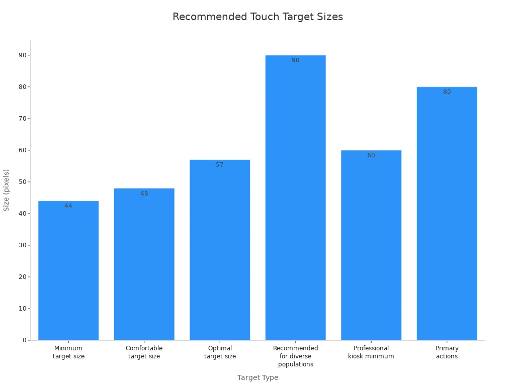
Make sure every button is big and easy to press. Small buttons are hard to use and can cause mistakes. Studies say the smallest button should be 44x44 pixels. Bigger buttons are even better for everyone. A good size is 48x48 pixels, but the best is 57x57 pixels. For many different users, try to make buttons 80-100 pixels wide. Space between buttons is important too. There should be at least 8 pixels between them, but 16 pixels or more feels nicer.
Target Size Type | Dimensions (pixels) | Approximate Size (mm) |
|---|---|---|
Minimum target size | 44x44 | 7 |
Comfortable target size | 48x48 | 9 |
Optimal target size | 57x57 | 10 |
Recommended for diverse populations | 80-100 | 10-12 |
Minimum spacing | 8 | N/A |
Comfortable spacing | 16+ | N/A |
Professional kiosk minimum | 60+ | N/A |
Primary actions | 80+ | N/A |
Tip: Use easy-to-understand icons and words on each button. This helps people know what each button does. Big, spaced-out buttons stop mistakes and make it easier to move around.
Put similar actions together on the screen. Put the most important buttons in the middle or at the bottom. Do not put too many choices on one page. People feel better when they only see a few options at once.
Visual Hierarchy
Set up your screen so people know where to look first. Visual hierarchy helps people find what matters most. You can use size, color, and where things are placed to show what is important.
Aspect | Description |
|---|---|
Navigation Organization | Content is organized into predictable zones, allowing users to efficiently discover information. |
Touch Target Size | Large touch targets (80+ pixels) with clear icon-plus-label combinations cater to varying literacy levels. |
Navigation Patterns | Horizontal navigation ribbons outperform side navigation, aligning with established reading patterns. |
Content Card Design | Card-based grids enable efficient scanning, featuring prominent imagery and clear headlines. |
Typography Hierarchy | Hierarchical typography presents primary information first, enhancing clarity and retention. |
Scrolling Mechanics | Vertical scrolling allows for depth without overwhelming users, matching expected smartphone behavior. |
You can use horizontal bars at the top or bottom for moving around. These match how people read screens. Card grids help people look through choices quickly. Each card should have a big title and a picture. Use bigger letters for main things and smaller ones for details. Let people scroll up and down to see more without crowding the screen.
Note: When things are always in the same place and the words are clear, people remember where to look. Set up your information Kiosk so people always know where to find things.
Immediate Feedback
Show people right away that the kiosk got their touch. Buttons can change color or move a little to show they were pressed. Sounds like a beep or chime can also help. Quick feedback stops people from getting confused or tapping again.
People get upset if the kiosk does not answer fast. Fast feedback makes people feel better and helps them use the kiosk easily. You can use simple moves or highlights to show the kiosk is working. If something takes longer, show a spinner or a bar that loads.
Tip: Always let people know when they touch something. People feel happier and make fewer mistakes when they see their actions work.
If you focus on these three things, your information Kiosk will be easy and fun for everyone to use. Big buttons, clear order, and fast feedback make the experience better.
Environment and Placement
Picking the right spot for your information Kiosk helps people find it. You should think about lighting, how easy it is to reach, and where people walk most.
Lighting Considerations
Lighting changes how well people see the kiosk. If you put your kiosk outside or near windows, sunlight can make the screen hard to see. High-brightness displays with at least 1,500 nits work best in bright places. These screens can make things up to 300% easier to see. Anti-glare coatings help by cutting down on reflections. You should check if sunlight or heat will hit the kiosk. Some screens need extra air to stay cool when it is hot.
High-brightness screens help people see better.
Anti-glare coatings make screens easier to read.
Good heat control keeps the kiosk working well.
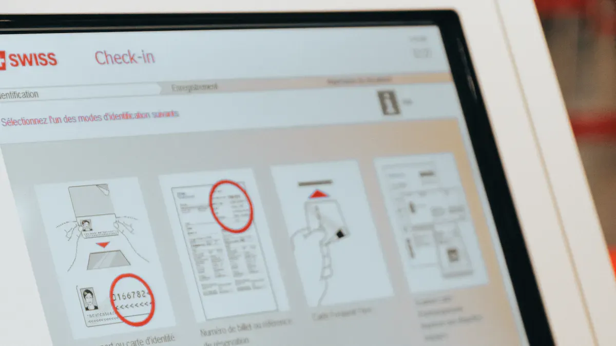
ADA Compliance
You need to make your kiosk easy for everyone to use. ADA compliance means people with disabilities can use the kiosk. You can add things like voice control, screen readers, and bigger text. High contrast modes help people who have trouble seeing. Screens that move up and down help wheelchair users. You can use touch, voice, or gesture to control the kiosk. Audio jacks let people use special devices.
Feature | Description |
|---|---|
Voice control and screen readers | Helps people who cannot see well use the kiosk |
Adjustable text size and high contrast | Makes words easier to read |
Multiple input methods | Lets people use touch, voice, or gestures |
Height-adjustable screens | Makes it easy for wheelchair users |
Physical keypads | Good for typing private information |
Audio jack compatibility | Works with special listening devices |
ADA compliance is very important in public places. Section 508 rules may be needed in government buildings. WCAG 2.1 Level AA is the rule for digital screens.
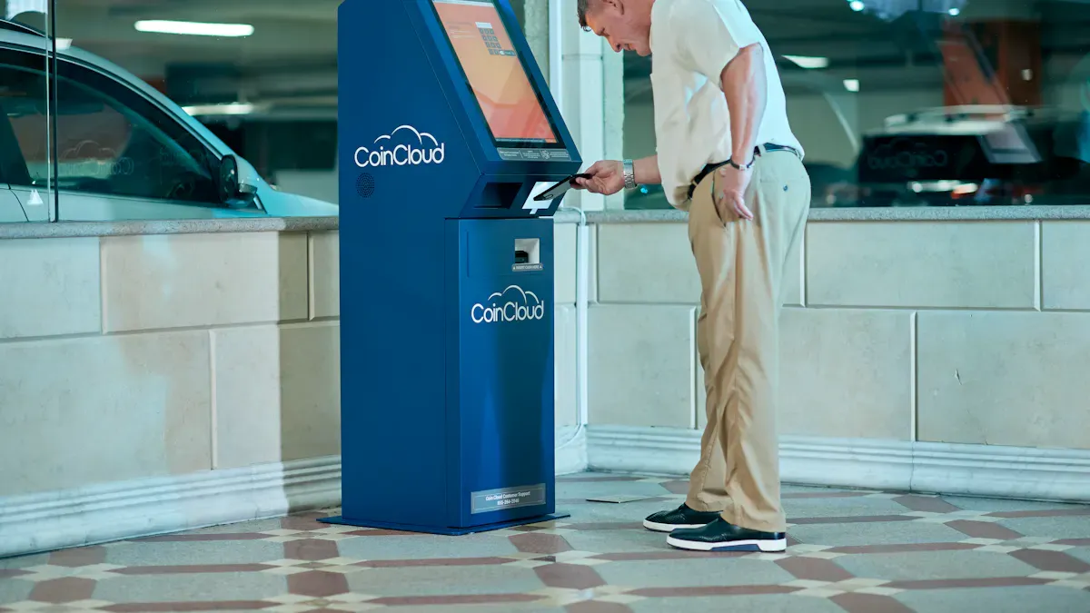
High-Traffic Areas
Putting your kiosk where lots of people walk by helps more people use it. Wall-mounted kiosks save space. They are easy to take care of and keep safe. You should check if there is enough room, if people can see it, and if everyone can reach it before you set it up.
Factor | Description |
|---|---|
Space Availability | Make sure there is enough space for people |
Visibility | Put the kiosk where people can see it easily |
Accessibility | Make sure everyone can use the kiosk |
Wall-mounted kiosks are good for busy places. You need to make sure people can see and reach the kiosk for the best experience.
Engaging Content and Modern Features
Dynamic Content Updates
You can keep your information Kiosk fun by changing the content often. Use clear, high-quality images so people know what they see. Tell stories about problems and wins to make things interesting. This turns your kiosk into more than just facts. Add videos or audio clips to make it lively and exciting. Make a plan to check and update your content on a regular schedule. This helps you get rid of old stuff and add new things. You can also see which content is most popular. Pay attention to what people like best. Use small movements or short animations to grab attention. Attract loops show news or highlights that change, so users stay interested but do not get confused.
Pick good images so people recognize things faster.
Tell stories instead of just listing facts.
Add videos and audio to make it more fun.
Check and update your content all the time.
Watch what users look at the most.
Use gentle movement to catch the eye.
Multimedia Integration
Adding multimedia makes your kiosk more fun to use. You can use augmented reality to show old photos over today’s scenes or put pretend objects in real places. Interactive notes let users tap for more facts or stories. You can put arrows on live camera views to help people find their way. Translation overlays help people read signs in their own language.
Feature | How It Helps Users |
|---|---|
Augmented reality photos | See history come alive in real places |
Virtual objects in real spaces | Look at items from every side |
Interactive annotations | Tap to get more facts or stories |
Wayfinding overlays | Follow arrows to find your way easily |
Translation overlays | Read signs in your own language |
You can also add voice assistants so people do not have to touch the screen. Predictive analytics can guess what users want to see next. Personalized suggestions make each visit special.
Contactless Options
Modern kiosks have many ways to use them without touching. You can add NFC readers for fast payments or check-ins. Barcode scanners let people scan tickets or coupons without touching the screen. Cashless terminals make paying quick and safe. RFID card dispensers help with hotel check-ins or getting into secure places. Mobile wallet support lets people pay or use the kiosk with their phones.
Kiosk Type | Popular Contactless Features |
|---|---|
Restaurant | Pay with cards without touching |
Retail | Scan barcodes, use cashless terminals |
Transit | Use NFC readers, strong hardware |
Parking | Pay without cash, use license plate recognition |
Hotel | Get RFID cards, tap to pay |
Vending | Use mobile wallets, small tablets |
Tip: Adding contactless features makes your information Kiosk safer and easier for everyone.
Test, Deploy, Monitor
Usability Testing
You need to test your wall-mounted touch information kiosk before you let people use it. Testing helps you find problems and fix them early. Try different types of tests to make sure your kiosk works well in real life.
Description | |
|---|---|
Functional Testing | Check if all buttons, links, and forms work as expected. |
Performance Testing | Run the kiosk for long hours to see if it stays smooth and fast. |
Load Testing | See if the kiosk can handle many users at once without slowing down. |
Accessibility Testing | Make sure people with disabilities can use the kiosk easily. |
Environmental Testing | Test the screen in bright and dim light to check visibility and touch accuracy. |
User Acceptance Testing | Watch real users try the kiosk and note where they get confused. |
Tip: Always test your kiosk in the place where you will install it. This helps you see how it works in real conditions.
Feedback Loops
You should keep improving your kiosk after you set it up. Feedback loops help you learn what works and what needs to change. Use these steps to build a strong feedback system:
Use analytics to see how people use the kiosk.
Track important numbers like how long people use the kiosk, what they look at, and where they tap.
Update your content often to keep it fresh and useful.
Fix problems as soon as you find them.
Ask users for their thoughts and use their ideas to make things better.
Note: Regular updates and quick fixes keep your kiosk helpful and trusted.
Performance Tracking
You need to watch how your kiosk performs over time. Tracking helps you spot trends and fix issues fast. Use these key metrics:
Description | |
|---|---|
User Engagement Metrics | Shows how much people use the kiosk and what they like to see. |
Interaction Tracking | Records the most popular content and common search terms. |
Session Analytics | Measures how long each session lasts and which screens people visit most. |
Content Performance | Highlights which content works best and what needs improvement. |
Conversion Metrics | Tracks how many people finish actions like signing up or making a donation. |
Tip: Review your data often. This helps you keep your kiosk running smoothly and meeting user needs.
You can make a creative wall-mounted touch information kiosk by thinking about how people use it. Make sure it is easy for everyone to use. Keep the screen simple and clear. Pick tough materials so the kiosk lasts longer. Plan so it is easy to fix or clean. Always update your content so it stays interesting. Use layouts that are easy to understand. Add pictures, videos, or sounds to make it more fun.
Try looking at alumni profiles, search by sport, or tap to find new features.
If you want to know more, look at Kiosk Design Articles or the Kiosk UX/UI Design Checklist. Give your thoughts to help make future guides better.
FAQ
What materials should you use for a wall-mounted touch kiosk?
You should choose commercial-grade steel for the frame and shatterproof glass for the screen. These materials last longer and protect your kiosk from damage.
How do you keep your kiosk accessible for everyone?
You can add voice controls, screen readers, and adjustable text sizes. Make sure the kiosk sits at a height that works for wheelchair users.
What is the best way to update kiosk content?
You can use no-code tools like WordPress or Google Slides. These let you change information quickly without coding. Regular updates keep your kiosk fresh.
How do you test your kiosk before launching?
You should run usability tests with real users. Check if all buttons work, if the screen is easy to read, and if people can find information fast.
Can you add contactless features to your kiosk?
Yes! You can install NFC readers, barcode scanners, and mobile wallet support. These features let users interact without touching the screen.
See Also
Discover The Essential Features Of Today's Touch Screen Kiosks
6 Essential Tips For Selecting Interactive Kiosks For Any Space
Top Reviews Of Stunning High-Resolution Kiosks For Exhibitions
Uncover 10 Unexpected Applications For Touch Screen Kiosks In 2026